The Two Most Important Words in Your iOS 15 Push Notification
What are those two words your users must read in a push? You now have to know this in advance when sending a notification to iOS 15. The latest version of the iOS sets limits to the push content length — as if time- and privacy-related restraints we’ve covered in the previous post were not enough. At any rate, there are ways to adapt to the new design of iOS 15 pushes. Keep reading to get news and recommendations from the Pushwoosh team.
What’s New in iOS 15 Push Notification Content
The push notification design has changed significantly in iOS 15 — less space is left for modifiable content.
App Icons Take Up More Space
First of all, an app icon now takes ⅕ of the entire push size. Consequently, you’ve got less space left for a push copy.
Fewer Characters Left for the Title — And the Count Drops Over Time
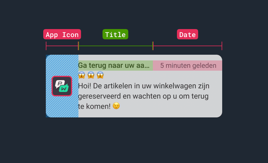
The push notification title now shares a line with the delivery time. If a push has arrived just now, you lose three characters from your maximum possible title length. If your push was delivered 5m ago and is still unread, six characters will be cut off your initial title.
For you to clearly see the difference, we put the English alphabet as a push notification title in iOS 14 and iOS 15. It turned out, the new design contains 10 characters less than the old one! And when a user expands the push, the app icon decreases slightly but doesn’t make more room for a longer title.
As for the total number of lines in a push, the same four lines can fit into an iOS 15 notification.
Non-English-speaking locations may be hardest hit by the limited character count. For example, in Dutch, no shortenings are used to indicate delivery time. So when instead of “5m ago” (6 characters) there is “5 minuten geleden” (17 characters), even fewer characters are left for the title.

Push notification copy (translated from Dutch): [Title] Get back to your purch… [Delivery Time] 5 min ago [Text] Hi! The items in your cart are reserved and waiting for you to come back!
And what if you decide to quit this title-length game and write no title in your push at all? In this case, users will see your application name at the top of the notification.
Other (Less Dramatic) Changes
- Users now have to long-press on the push to expand it.
- The font size is the same for collapsed and expanded pushes.
- CTA buttons have a different form now.
- A media attachment banner is now displayed under the copy.
How to Adjust Your Push Notification Content to iOS 15 Design
Choose Those Few Words for the Title That’ll Do All the Work
Imagine your notification is not read straightaway — with Notification Schedules and Focus Mode, this is the most probable turn. Which words from your normal title will stay visible in the push preview?
We recommend you put first:
[for Media & Entertainment apps]
- The keywords for your promoted news topic, for example, Bond premiere or Presidential 2022.
[for E-Commerce]
- A strong motivator to complete the purchase urgently, such as Sales: 3 Hours Left.
- A more informal wording like “We’ve got your shoes” (20 characters) instead of “Your favorite item is back in stock” (35 characters).
[for Subscription-Based Apps]
- A call-to-action that will get a user back to your app, for example, Try Premium for free.
- A personalized appeal such as Jane, have you tried… — and you may leave the title hanging and reveal your intrigue in the push notification text below.
[for Gaming]
- A promise of a reward for another round of playing, for example, Daily prize awaits!
- An invitation to play against another user (if there is an interactive competition feature in your game) — for example, Maria challenges you.
These recommendations may look familiar to you if you’ve ever searched for ways to increase your push notification CTR. General advice on how to write a compelling copy apply here too — the most important difference is that in iOS 15, you have to fit your title into the minimum character count.
Preview Your Pushes Before Sending
Certainly, you can simply count the number of characters in a push notification title, but it won’t hurt to check how the complete push looks.
If you have stronger doubts about how your push will be displayed on the real screen, try sending it to your test devices or a specified segment that includes you and your team.
Test for the Best [Time to Schedule Your Pushes]
“The best time to send” may sound anachronistic as in iOS 15, it’s up to users to permit push notification delivery at particular time slots. However, A/B testing is still a technique to use in order to determine the hours when users are most likely to read your pushes immediately. When you know those “golden hours” precisely, you may feel safe even if you send a push with a copy that is a bit too long — and still expect high CTRs.
Send Effective Push Notifications to Any OS
iOS updates have been keeping marketers on their toes for years now: from the first rumors on the IDFA changes in iOS 14 to the latest, allegedly user-centered features in iOS 15.
To counteract the ever-changing reality and adjust your strategy promptly, you may need the support of experts in mobile communication technologies. This is what we are at Pushwoosh Team, helping businesses from across the world and industries to execute efficient marketing campaigns. Our job is to convey your message to the right users at the right time. Shall we discuss your case in detail?


