In-app messages are known to be addictive: once a marketer starts using them to drive app user engagement and retention, they never want to return to the pre-in-app times. What makes in-apps so extraordinarily effective? What are they, to begin with, and how can you make use of them in your case? We’ll answer your questions using 21 examples from the world’s leading apps.
💌When are in-app messages more relevant than push notifications? And how do the two channels come together? Discover in our dedicated blog post
3 advantages of in-app messages
In-apps offer a range of advantages when compared to other types of mobile communications:
- In-app messages arrive when a user is already interacting with an app. For this reason, users perceive in-apps as less obtrusive than push notifications, emails, and branded communications sent in messengers.
- In-app messages receive focused user attention. For the business, this means more effective marketing communication.
- In-apps don’t require any prior user consent or opt-in. For marketers, this is a great way to maximize the reach of their communications.
Moreover, as in-apps appear in response to the user’s real-time behavior, this type of mobile communication can show unparalleled relevancy and significantly drive user engagement.
Why use in-app messages? 7 Clear benefits
1. Reach your entire active audience
You don’t have to request user permission to send them in-app messages, as you do in the case of push notifications or emails.
2. Deliver your message quickly — and make it seen
In-apps are targeted at the users that are active in your app in real time. Using this format, you can deliver any kind of urgent notifications and expect a prompt user response.
3. Encourage users to take target actions
In-app messages are effective in a broad range of use cases, from new user onboarding to conversion to purchase and in-app surveys. To dwell on this, you may jump straight to the paragraph on in-app messaging use cases we have below.
4. Ensure a seamless user experience
In-app messages are shown directly within your application, so users don’t get disturbed from their primary activity in your app. Rather, users may even feel grateful for a useful tip or a promo code that you send them at the right time.
5. Keep your marketing communications aligned with your branding
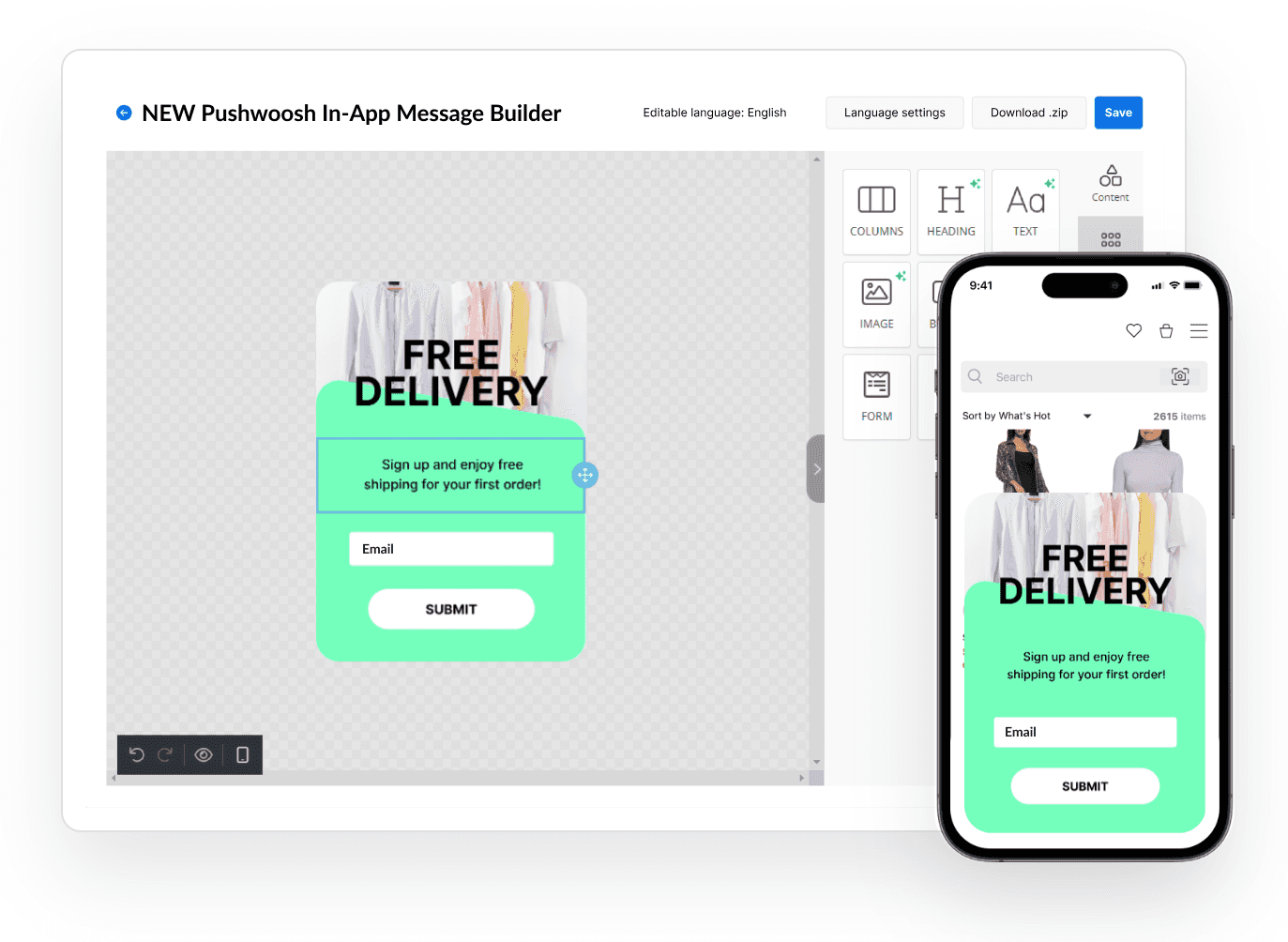
If you use the Pushwoosh in-app messaging solution, you can easily design an in-app perfectly aligned with your brand guidelines. You can use a default in-app template as the base and change its colors, text, buttons, and the entire design concept in just a couple of clicks.
This differs in-app messages from push notifications that depend a lot on the OS requirements.
6. Receive immediate user feedback
In-app messages are perfect for holding all kinds of surveys and collecting feedback. All your users have to do is just type their answers in the fields, click on the button, or pick the right amount of stars to rate your app. Interacting with an in-app takes less time than completing any other survey, so you increase your chances of receiving a response.
7. Stay independent from any messaging platform
In-app messages keep you independent from WhatsApp, Facebook, and any other messenger. Firstly, this means you can be certain about your message’s deliverability. Secondly, this sets you free from the need to adapt to other platforms’ policies.
What kind of apps can benefit from in-app messaging?
Quick answer: all kinds of apps.
In fact, in-app announcements provide ample opportunities to the apps of all industries, regardless of their monetization model. To ensure we don’t exaggerate, we recommend you download our new in-app messaging ebook:
- Explore the crucial use cases for media & entertainment apps, e-commerce, gaming, and all sorts of subscription-based apps.
- Learn which events work as the best triggers for in-app messaging.
- See 35 actual examples of in-app messages from the world’s leading apps.

In-App Messaging Ebook Preview
Otherwise, keep reading to get an overview of the in-app message usage.
What in-app message formats are there? (with examples!)
In-app messages come in six main formats:
1. Half-interstitial in-app message
It looks like a pop-up that covers the center of the screen. This form of the in-app message is typically used to display a service notification or guide users through the app as part of onboarding. Promo offers and referral program announcements may be designed in this format too.
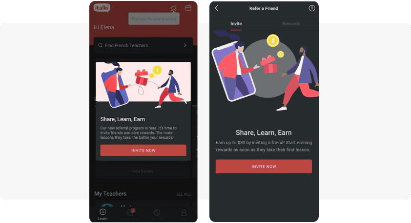
italki uses half-interstitial in-app messages (on the left) to attract language learners to their referral program (on the right).
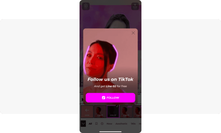
VOCHI expands its fanbase on TikTok by sending half-interstitial in-app messages and offering an editing feature in exchange for following them.
2. Interstitial in-app message
This pop-up covers most of the screen. Discount offers in e-commerce and subscription-based apps typically arrive in this format. Interstitial in-apps are also used to show users their progress in the app adoption.
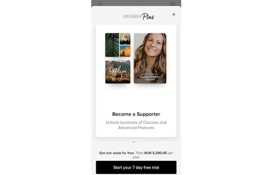
Insight Timer uses interstitial in-app messages to encourage users to upgrade.
Now you can easily create in-app messages yourself with no coding and (almost 😉) no designer skills! Use the enhanced drag-and-drop Pushwoosh In-App Builder!
3. Sticky in-app message (header or footer)
This type of in-app message occupies the header or the footer of the screen. Sticky in-apps usually have a background image, some copy, and a CTA button — all customized to fit the style of the app.
The most popular use case for a sticky in-app is asking users to opt-in for newsletters or push notifications (the so-called ‘opt-in prompt’).
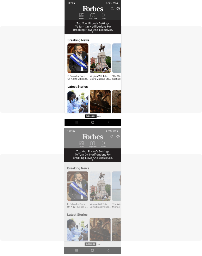
Forbes uses a sticky header to get users to opt-in for push notifications.
Media and content apps may choose to use sticky footers to promote paid subscriptions. This in-app message format looks less obtrusive, and yet, it can still be effective. Especially when a small sticky footer expands into a full-screen in-app once a user clicks on it.
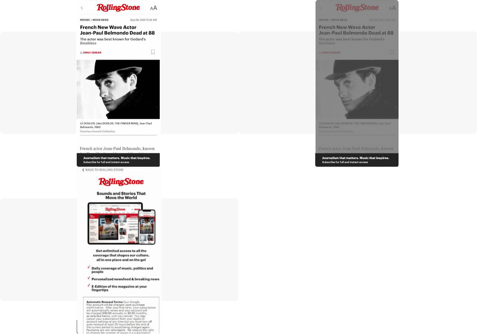
Rolling Stone uses in-app messaging to promote its paid subscription — and stays classy at the same time.
Sticky in-apps are also great for informative communications such as feature updates and changes in UX.
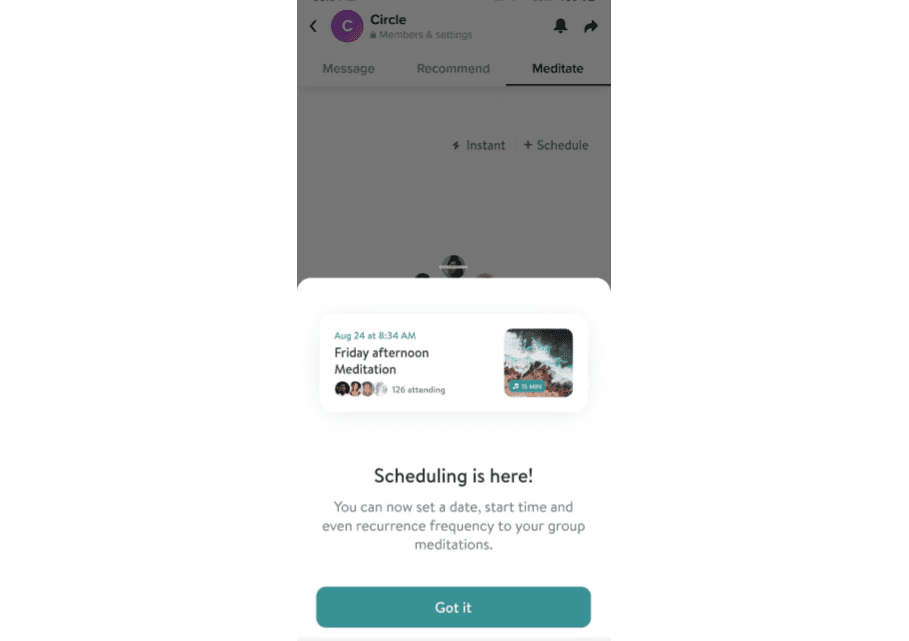
Insight Timer announces a new feature with the use of a sticky footer.
4. Full-screen cover
As the name suggests, this kind of in-app message covers the entire screen. Apps use this format to give action-based notifications, for example, asking users to opt-in for newsletters (as an alternative to a sticky in-app message). E-commerce discount offers may also come in this form. User onboarding normally happens via full-screen in-apps too.
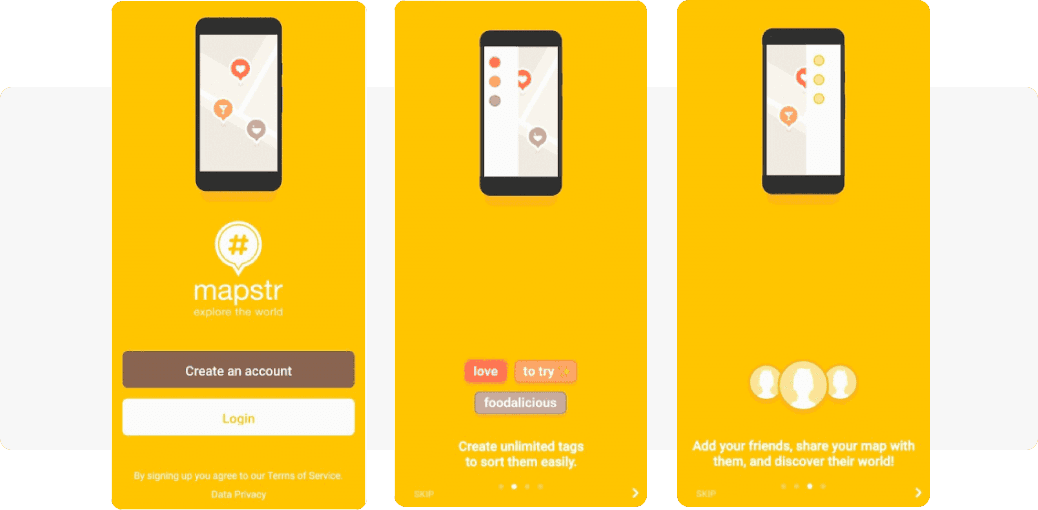
Mapstr onboards new users with full-screen in-app messages.
5. Inline in-app message
What differentiates an inline in-app message from all the other formats is its position right within the app content. These prompts are an organic part of user experience. Inline in-apps don’t interrupt users in their activity, and it’s more natural for users to respond to them.
Apps can use inline in-app messages for a variety of use cases: from promoting new (though non-essential) features to getting more push notification subscribers.
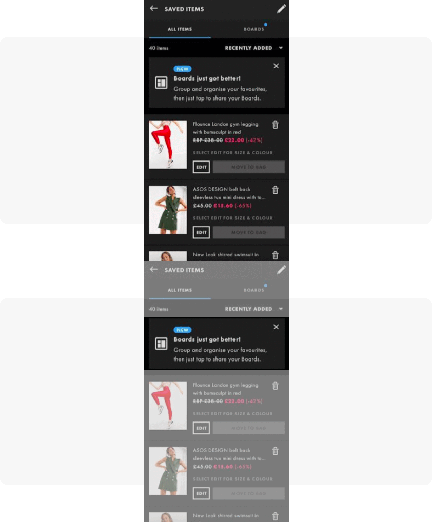
For ASOS, inline in-apps are a go-to format. Low-key messages keep users focused on what brings real revenue to the app — its bold-style clothes.
With Pushwoosh, you can easily incorporate inline in-apps into your communication strategy, enhancing user flow with a seamless and empathetic touch.
6. In-app stories
‘Stories’ is a dynamic in-app feature that helps you create content similar to social media stories. You can apply the feature to your basic pop-up or inline in-app messages.
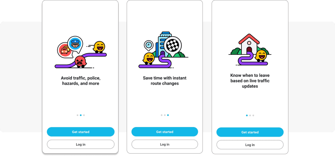
Waze designed its onboarding flow as in-app stories. Their three-piece slider is animated by default, so a user needs to take no action to see the next value the app presents.
In-app stories are easy to set up and launch with Pushwoosh. All you need is to insert links to several images of your choice, define the user segment and the event that will trigger the appearance of your in-app message sequence, and set it live.
7. In-app videos
In-app video is a format that engages users through dynamic visual storytelling. This tool is particularly effective in use cases such as showcasing app features, providing tutorials, sharing testimonials, and presenting promotions.
With its ability to simplify complex concepts, evoke emotions, and guide users, in-app video enhances engagement and enriches the overall user experience.
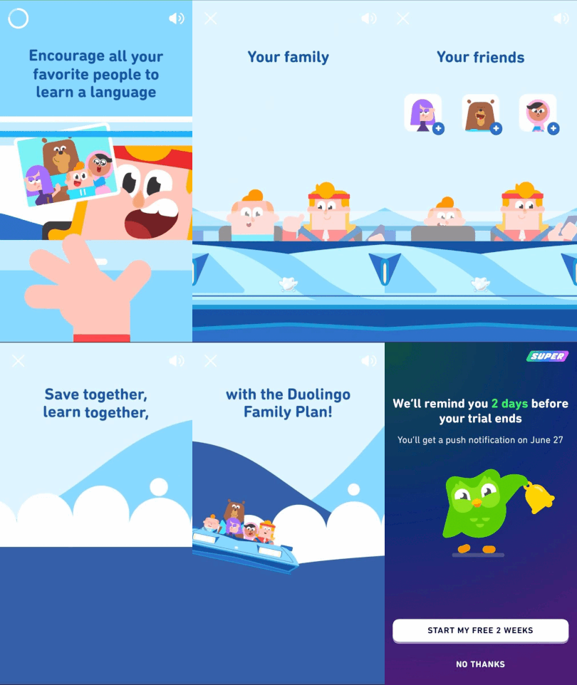
Duolingo leverages in-app videos to showcase the benefits of its Family plan.
In-app messaging use cases and best practices (with examples!)
1. Onboarding in-app message examples
Welcome messages usually take the form of an in-app carousel — a sequence of in-app messages triggered by a specific action.
Typically, an onboarding in-app flow starts with an ‘ApplicationOpen’ event, so when a user opens the app, they receive your messages displayed on the screen.
Onboarding in-apps may show the value of your product and guide users through their first steps in your app. As a result, users should stay in your app longer, experience the AHA moment, and come back to enjoy your app next time.
Onboarding in-app messages can come in different formats:
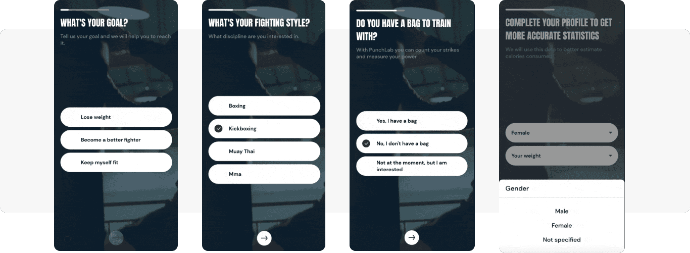
Punchlab using full-screen covers.
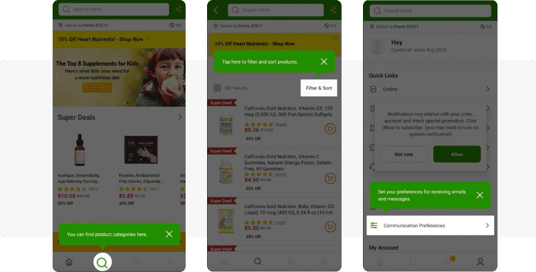
iHerb uses inline in-apps.
2. Promotional in-app message use cases
With in-app messages, you can promote:
- Your and your partners’ content
Media apps really like using in-apps for this purpose as it brings them great results.
- Special offers
These can be holiday discounts or any limited-time offers targeted at specific user segments.
- Your referral program and any kind of social sharing
Take Insight Timer as an example. It functions as a subscription-based app, but it also has to think in terms of growing its community to support their teachers who work for donations. So once a user signs up for an upcoming event, the app suggests that the user promotes it among their friends.
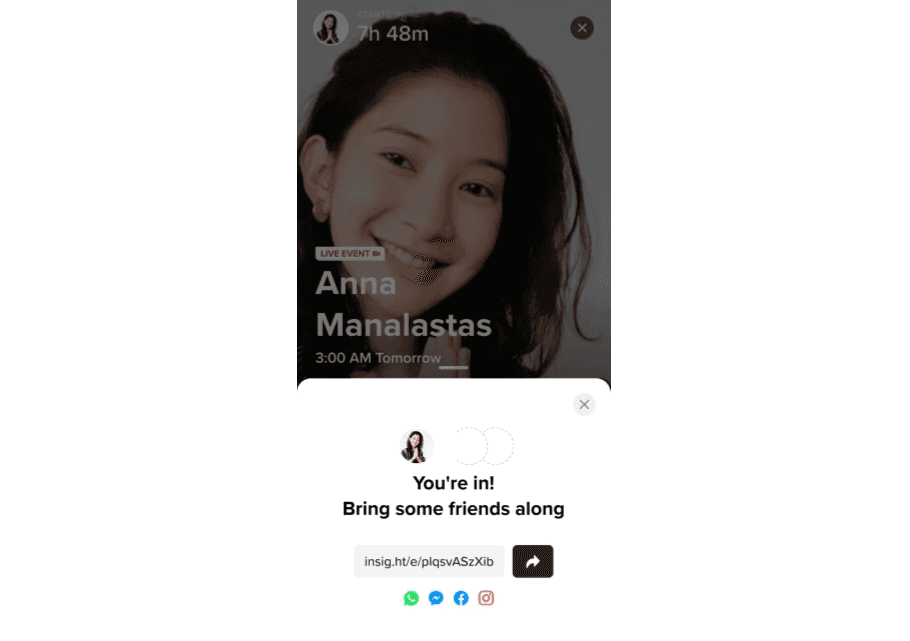
Insight Timer uses in-app messages to promote referrals.
You may also remember the italki example we reviewed above: the app uses in-app messages as a way to encourage social media sharing.
3. Feature announcement and promotion
Imagine you have a new feature in your application and you want more users to adapt it. With in-app messages, you can draw maximum attention to your new functionality and speed up its adoption.
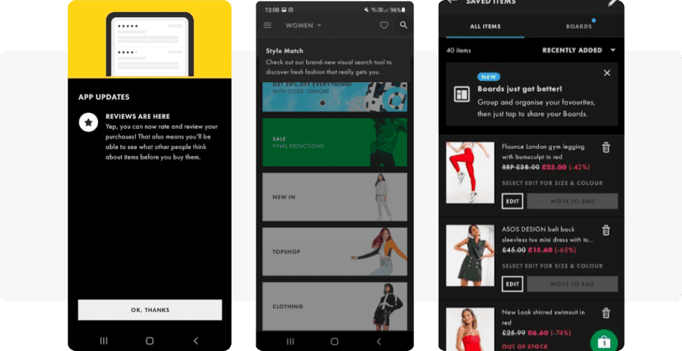
ASOS uses a broad range of in-app messaging formats to promote new features: full-screen, sticky, and inline in-apps.
Or, let’s say you doubt whether your entire audience will make use of a new feature. To avoid a costly mistake, you may test your hypothesis of a new feature first — just present it to a selected segment of users in the form of in-app messages and see how your audience reacts.
4. Customer service and transactional in-app messaging best practices
A banking app may use in-app messages to notify their IOS or Android customers about insufficient funds for a transaction or update them on a card delivery status.
For e-commerce, the most typical case is a transactional in-app message confirming that an item has been added to a cart or a certain list in favorites. Order status confirmations may arrive in the form of an in-app popup too.
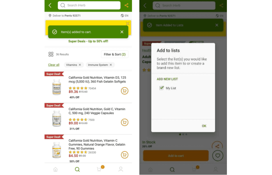
iHerb sends service inline in-apps
Using in-app messages, you can also add a warning, tooltip or comment on the app flow. No matter how long it’s been since the app launch or its latest version release — with customizable in-apps, it will be quick and simple, so both your customers and your internal team may feel at ease.
For example, at some point, Insight Timer had to communicate the risk of injury while doing yoga. They designed an in-app and conveyed the message promptly to the audience.
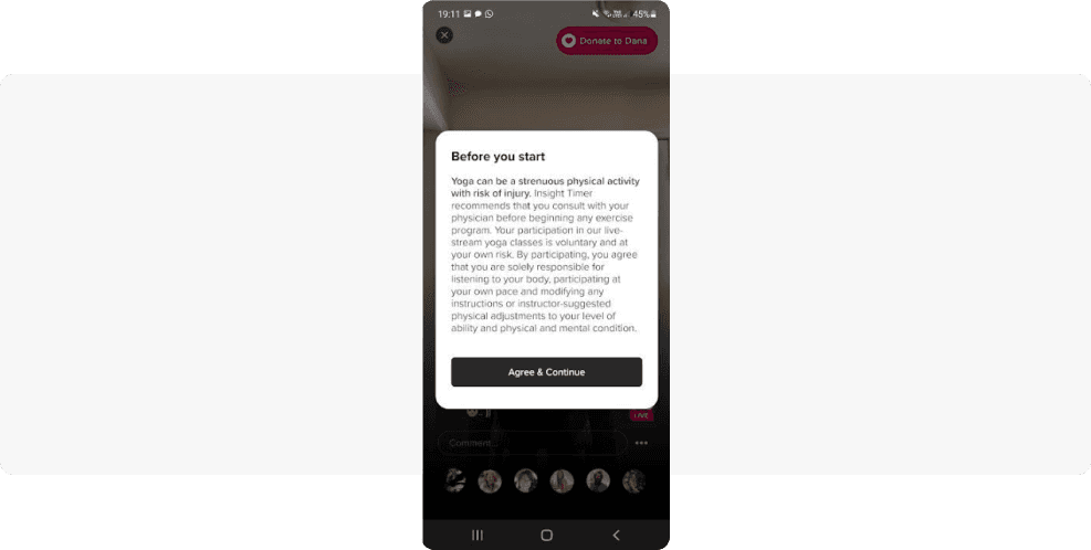
Insight Timer sends service in-app messages.
5. Upgrade subscription plans with in-app messages
Subscription-based apps may show in-app messages to users who have come to the end of their trial period or have only used a basic plan so far. A timely in-app message can explain the extra value users will enjoy with a premium subscription or appeal to their fear of missing out. As a result, users may feel motivated to upgrade.
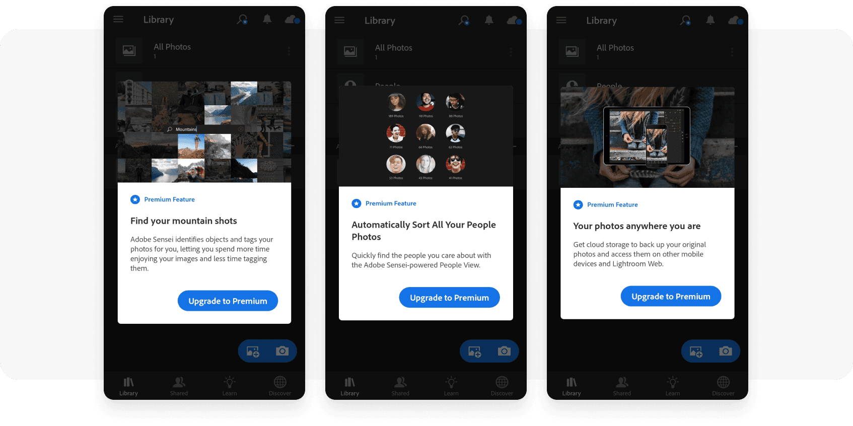
Lightroom prompts upgrading in a series of in-app messages highlighting the app’s premium features:
6. Increasing push notification opt-in
Combined with push notifications, in-app messages allow reaching up to 100% of your user base. High relevancy of in-apps results in more conversions and more revenue for an app publisher.
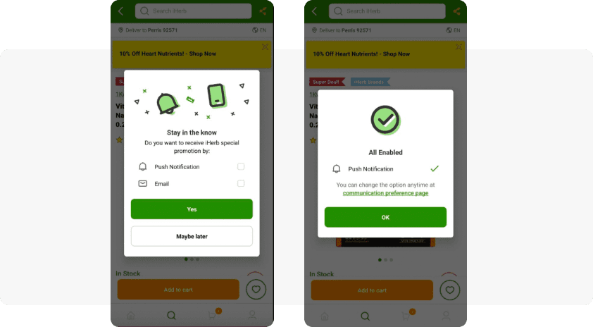
iHerb shows an in-app message suggesting users opt in for their push notifications and/or emails.
Learn more ways to increase your push notification opt-in rate from our blog post.
Implement in-app messaging to your omnichannel strategy with the Pushwoosh out-of-the-box solution
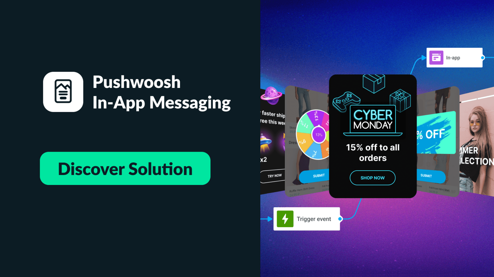
Adding in-app messages to your mobile messaging strategy boosts engagement and drives conversions for desired user actions. With Pushwoosh Customer Journey Builder, you can easily plan and streamline campaigns using in-apps, push notifications, and emails together. You’ll define key events for triggered communications and segment users based on their behavior and profiles.
Creating and sending in-app messages is a breeze with the Pushwoosh no-code in-app editor. No coding or design skills are needed to make your notifications look great. The result: user-friendly in-app messages sent in response to user behavior, leading to increased campaign ROI.
Discover the Pushwoosh in-app messaging solution in more detail:
In-app messages FAQ
What are in-app messages?
These are messages or alert delivered directly within a mobile application while users are interacting with the app. In-app messages keep users informed about important updates, promotions, or actions they need to take while using the app.
What is the difference between in-app messages and push notifications?
In-app messages are displayed directly within the app interface. Push notifications, on the other hand, are messages sent to a user’s device home screen, even when the app is not open.
Where are in-app messages displayed?
Mobile marketers have the flexibility to position in-app messages in various locations on app screens, such as at the top or center, as well as covering most of the screen according to the chosen in-app format (refer to the dedicated section of this blog post for more information).

![What Are In-App Messages? [21 Great Examples Inside]](/content/images/2021/09/Whar-Are-In-App-Messages.png)


